Thursday, September 25, 2008

Pause in programming

We're taking a hiatus from working on the house to work on this little guy:

You can read about our adventures with our new son Aaron at http://atl-adventure.blogspot.com.

Sunday, September 14, 2008

We're baack...check out the nursery

Preparations for the little munchkin have been keeping us busy, hence the lack of blogging for a while. The house is really starting to feel like home, and just in the nick of time.

The nursery is nearly finished! We have a few more pictures to hang, but it's pretty close. We really wanted a fun, playful room - and one that was gender-neutral since that's still a surprise for us. We managed to pull it together on a fairly reasonable budget as well! Check it out:


Crib: Childcraft Contemporary from Target - recommended by Baby Bargains. Easy to put together and quite sturdy
Sheet: DwellStudio Circles from Target
Mobile: Hand-me-down from a friend
Giraffe: Relic from my own childhood bedroom
Changing table: A bookshelf my grandpa made years ago, with a few baskets from Pier one and a contoured changing pad. Cover is Tiddliwinks from Target.
Mirror with mobile: From local Ithaca artist Werner Sun. LOVE his stuff!
Curtains: Barnslig from Ikea.
Bookshelf: From my college days...World Market, I think.
Lamp: A great shower gift from my Mom...from Target, I think.
Quilt: A handmade gem from my Mom's friend Diane - complete with bright colors and safari animals.
Rocking chair: An antique from my Grandma Hall. With a new seat cushion from Pier One.
Dresser: Another relic from my childhood decorated with some fantastic shower presents from family and some artificial flowers from our old house.

Saturday, August 23, 2008

Favorite things...

Parts of the house are still in disarray, but there are little enclaves that are starting to look like we actually live here! Here are a few of my favorites.

Before


Now


Before


Now


***

We had this amazing energy audit yesterday that should help make our house much more efficient and also win us a bunch of tax credits. Paul has the full scoop. Details coming...

Friday, August 15, 2008

Did the deed!


Stair treads?!?


When you walk in the front doors of our house, you go up six stairs to get the main living area (and six down to get to the garage.) When we embarked on laying bamboo floors throughout, we decided to save the stairs for a later date. That was largely because we knew they'd be a challenge. The economical bamboo that we bought for the rest of the house ($3,000 for 1,400 square feet!) was only 3/8 inch thick, and the manufacturer didn't provide any coordinating stair pieces. (See photo to the right.)

Now that we're ready to put wood on the stairs, we have a little dilemma. The only bamboo stair treads that will fit out space cost $80 each - a grand total of $1,200 with shipping, which is nearly half of what we spent on the rest of the house! That means we're likely going to need to go with some other type of wood for the stair treads - which could cost as little as $300 depending on what we pick. But how do we handle this aesthetic dilemma? My initial thought was to try to match our flooring as closely as possible, but then I found these cool pix that use totally different kinds of wood - which seems to be a great way to embrace the problem. Any thoughts?

Tuesday, August 12, 2008

Slow movin'

I haven't updated much recently because it doesn't seem like much is changing at the house these days. We're slowing chipping away at little projects. Paul added the rest of the door handles to our kitchen cabinets yesterday. We used these great IKEA handles (without the round discs on the back.)


Paul also trimmed the trees out front, which means you can walk in the front door without being brushed on the head with pine branches. Nice.

And this week, a painter is working to paint our entire main living space in Glidden Gentle Tide.


It's exciting to have the wall color in the works, but the house is in shambles once again. Paul said it perfect last night: There's ANOTHER DeWalt radio in our living room.


It's the quintessential sign of the state of things at our house.

In the meantime, we're only eight weeks 'til D-Day - yikes! The baby's room is currently packed solid with odds and ends from the living room, and boxes of gear from last weekend's baby shower that I haven't begun to open. Amid all of the chaos, I've adopted a new mantra: we will be ready in time...we will be ready in time...

Monday, August 4, 2008

Advice from the pros...

Many of you know, I absolutely LOVE the style of Sherry and John from This Young House. When I was torn about the decorating advice for our living room/dining room/kitchen area, I called on them for help. Here's what they came up with:


Thoughts? Comments? Additions? I'm off to get paint samples tonight, and will hopefully hire a painter by the end of the week. (With all we've got to do before baby arrives in only 9 weeks, it's time to start out-sourcing a bit!)

Saturday, August 2, 2008

Apartment before shots...


For dramatic effect, scroll down to see the afters...

Friday, August 1, 2008

Craigslist rules!


Not only does it have great deals on stuff you need - it's great for getting rid of stuff. This week alone, I've gotten rid of two old sinks and five bushes that I want to remove from our yard. And for the bushes, the recipient is going to dig them out herself. How great is that?!? Next up, the wooden pallets in our driveway.

Thursday, July 31, 2008

Apartment finished!

We put the final touches in last night on the one-bedroom apartment under our house, and our first tenants move in today! (This is part of the whole scheme we have to cover our ridiculously expensive Ithaca taxes. Seriously, property tax is cheaper in NYC.)

Paul put A LOT of time into this place - painting all of the kitchen cabinets and laying new floor in the kitchen and bathroom. There's also new light fixtures throughout, and paint on the walls. With the carpets cleaned, it looks like a completely different place. Check it out.

Shiny new kitchen


Spiffy bathroom


Happy Paul

Friday, July 25, 2008

First load

It's a red letter day on Meadowlark Drive. We can actually do laundry!

One of our splurges in the house renovation were these beauties. They're tiny compared to other front-loaders, but still with 3.7 cu. feet of capacity.

They were installed today in our hallway closet, which formerly served as a coat closet. While I would LOVE the extra closet space - really I would - the inconvenience of no easily accessible washer and dryer with a newborn was not something I wanted to deal with. (There is a coin-operated washer and dryer in the basement for the tenants, but that involves a flight of stairs and a trek through the garage.) Paul was sold because he really wanted a front-loader. Our antiquated top-loaders don't even exist in England anymore. The first load is rattling away as I type - music to my ears.

Tuesday, July 22, 2008

We're in!

...just, but we made it. We've come a long way, but it feels like we still have a pretty long way to go. Since today is the first day that the computer is up-and-running, I'll post a few pix and then get back to unpacking.


Friday, July 18, 2008

Great color!

I want our kitchen walls and breakfast bar to look like this!:


Kudos to Beach Bungalow 8 for the inspiration!

Thursday, July 17, 2008

Moving week...

I haven't posted this week because I've been busy packing boxes to prepare for the big move this weekend! - and there's not much interesting about that. The house is coming along, though. I had my doubts as to whether it'd be liveable by Saturday, but I think we'll make it.

Wood floors are now down everywhere and the kitchen appliances are in place (minus the microwave, which has been on backorder.) By the end of the day, we'll have at least one functional bathroom - VERY important for the pregnant chick this weekend!

Paul has had a few unexpected business trips, including one this week, so we have much less painting done that we originally planned. But now I'm thinking it will be better to live in the space for a while before we finally settle on colors. (I made some spur-of-the-moment, very bright choices for the bathrooms, and now I'm wondering if I should have thought about it a little more.)

A few more days, and then we'll actually be living in the house, which will make it much easier to clue y'all in on what it looks like.

Until then, this picture was the inspiration for our guest bathroom. I was thinking bright, cheerful, fun...but in real life the paint on the wall looks a little day-glo.
Colors are Laura Ashley Haystack and Summer Pudding.

Stay tuned for a pic of the real deal.

Friday, July 11, 2008

Sitting high?

The vacation at the beach house has been just the thing we needed to give us a break after a month of working pretty hard on the house. While we're here, Shaun from Top Notch construction is finishing up the details in our kitchen and bathrooms and laying bamboo floors in the rest of the house. While I'm grateful for the break, I'm really curious to learn how things are going!

In the meantime, there's only one piece of the house I'm stressing about - the breakfast bar. Paul and Shaun debated for quite a while about how high to make the bar that sits between the kitchen and dining room. They settled on 47 inches. Why? Because when we tile the kitchen backsplash, that will leave room for two full 4-inch tiles between the kitchen counter and the raised bar. Fast forward two weeks. I start looking for bar stools and realize that standard bar height is actually 42 inches. Why didn't I think of looking this up before? I'll blame my pregnant brain. In any case, now I'm stuck with having to find extra tall bar stools. And of course they're significantly more expensive than normal bar stools.

My current top choice are these industrial-looking chairs from All Barstools. I'm thinking the look could be cool with our bamboo floors, especially if I can make/find some cool cushions for them.


I've also heard Pottery Barn has some cool-looking tall stools. I'm hoping I can find some on sale!

Monday, July 7, 2008

Painting brick?

As you may have seen, we have some 1970s multicolored brick that dominates our living room. It's not my favorite part of the house, and we've contemplated painting it. But if we do, I know there's no going back.
This is a photo from before we bought the house, with the other owner's furniture.

This week, we've staying at a beach house in Manistee, Michigan (which is absolutely a wonderful spot and beautifully decorated). And what have they done? Painted their fireplace - which makes us rethink our decision.
Fireplace at our wonderful beach house.

Thoughts?

Wednesday, July 2, 2008

Painting and pregnant

Ever since I can remember, I knew that pregnant ladies weren't supposed to be around newly painted rooms. Since we're painting nearly the entire house over a period of several weeks, that would have meant I was pretty much banned from the new place during construction. So I hunted far and wide for one of the new, non-VOC paints. (VOC stands for volatile organic compound - basically the stuff that's bad for you.)

I checked out Sherwin Williams, Home Depot and Benjamin Moore, which all carry non-VOC lines. But we finally settled on Olympic Premium from Lowe's. It's less than $25 a gallon, has very little odor, and has covered our white walls in two coats (with no primer).


The only place we'll probably use a stinky paint is in the bathrooms and kitchen, where we're looking for guaranteed durability and mildew resistance. In those places, we'll probably go with Valspar Kitchen & Bath paint. We used it for the apartment kitchen, and it covered amazingly in one coat. Plus, Consumer Reports gives it a high rating.

** Kudos to our friends Norah and Megan, who helped me paint up a storm last night. They rock!

***One more note about non-VOC paints: While some are marketed as environmentally-friendly, the Olympic line really isn't. But on the back of any paint can, you can find the VOC content in grams per liter.

Sunday, June 29, 2008

Color mania!

It's been one of the toughest things to figure out: How to tie in our furniture, kitchen counters, our new 1970s brick fireplace with a few gallons of paint. The problem is that when you walk in the front door, you can immediately see the living room, dining room and part of the kitchen (which only has a breakfast bar separating it and the dining room.) Oh, and we'd like to avoid painting the brick or buying new furniture. Here's a sketch of the layout:


The goal is to paint as much as possible before the floors and furniture go in - it's just easier. So these are the color palettes I've come up with. (Bearing in mind this space still looks like a complete construction zone.)


The back wall spanning the kitchen and dining room (as well as the rest of the kitchen) will be painted in Sherwin Williams Drizzle or Watery. The long wall running from the dining room to the living room will be painted Sherwin Williams Cachet Cream. This was the toughest color to come up with because it's got to coordinate with all three spaces. The hallway and front wall of the living room I plan to leave untouched for now. I'd like to paint them a shade or two deeper than Cachet Cream, but I want to make sure it's not going to be too much once the furniture is in. Here's a layout with some of the colors inserted.


Thoughts? Ideas? I'd love your input!

Friday, June 27, 2008

Thinkin' about the doorbell


This is the plastic 1970s doorbell cover that you see directly in front of you when you come into the front door of our house. Any ideas on what to do with the homily thing? Buy a new cover? Make something out of wood and cover with fabric? I'd love to hear your suggestions...

Wednesday, June 25, 2008

Just when it seems it will never end...

We finally made some progress! Our contractor Sean is letting Paul borrow his battery-operated brad nailer, which has increased the speed of the bamboo-floor-laying considerably. On top of that, the kitchen cabinets are being hung, the dining room wall is down, and the bathrooms are being tiled. In short, it's finally looking like a house again.

I'm quite happy with how the tile in the guest bathtub had turned out! I gambled and picked up a box of thin white tiles to make a stripe inside the bath. I was hoping it would tie in the edge tiles (which I could only find stocked in white, and didn't want to special order.)

The next dilemma - kitchen lighting. We've decided to go with a ceiling fan (ugly, but a good move in a house with no A/C), pendants above the breakfast bar, and a light fixture above the sink. Finding them all to match in a style we like is hard work. And of course the pendants I like from Lowe's aren't sold in New York. Next stop - ebay. And tonight, test paint swatches go up in the living room and kitchen.

Kitchen taking shape

Guest bath

Monday, June 23, 2008

Bamboo on the way down

It was a slog this weekend experimenting with the best way to lay our new bamboo floors. The floors are Yanchi Ecoline strand woven bamboo from Build Direct, a flooring liquidator in Vancouver, British Columbia. I can't say enough about their products and service.

Paul and our friend Joshua (many kudos for his relentless help this weekend!) started off Saturday morning with a manual hardwood flooring nailer, which regularly split the floor boards. Not good. Since we went with the economy bamboo, the tongues are thinner than traditional wood floors, and bamboo is known to be brittle anyway. After struggling with that for half a day, they switched to pre-drilling holes in the tongues and then hand-nailing the floor down - a huge improvement on the splitting front, but an agonizingly slow process.

Sunday morning I was off to Home Depot to find a better solution. I came back with a rented pneumatic finishing nailer and a compressor. After experimenting with depth and pressure, we settled into a routine that still involved pre-drilling, but went considerably quicker. We finished the guest room, and got started on the baby's room - not as much progess as we would have liked in a weekend, but hopefully our new system pays off.

The miraculous nail gun

Flooring installed

Saturday, June 21, 2008

Come along for the ride

We're a few weeks into this major project that Paul and I have embarked upon - namely buy a semi run-down house, gut it, and fix it up. And it's dawned on me that we're learning a lot that could be useful. So this will be the story of the making of our new, humble abode in Ithaca, New York.

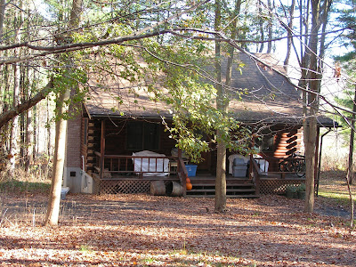
Because I'm starting up this blog well into the process, I'll play catch-up for the first few weeks to bring you up to speed. For starter's, here's where we live now.

And here's where we headed.

Our realtor fondly referred to the style as a "raised ranch." There is a 1200 square foot, three-bedroom home upstairs and a 1-bedroom apartment downstairs. (We'll be renting that out to defer the cost of taxes in New York.)

The house - and most of the others on our block - were originally built in the 70s as rental properties and were later sold. The previous owners of our house were veterinary students who graduated and moved out this spring. (Yes, there was animal dander everywhere!) So that's the start. Stay tuned for the details.